Tarmac Brand
We were tasked with building the Tarmac brand from a blank canvas.
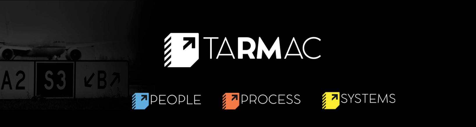
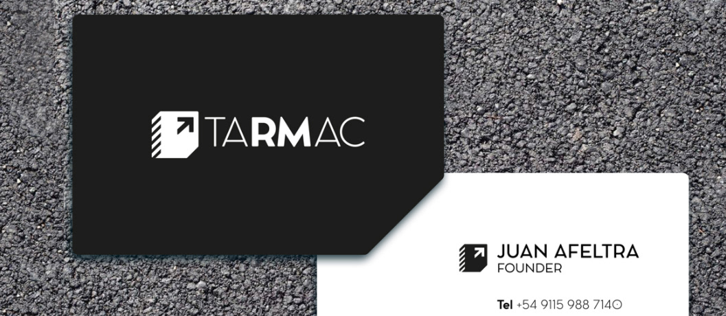
Using the tarmac (asphalt) as inspiration we developed a modern logo founded upon tried and true core principles, which is commanding yet calculated and empathetic.
The logomark is an abstracted arrow sign from a runway, representative of growth, guidance, instruction, process, navigation, and advisement, to showcase its revenue management consulting brand.
Tarmac’s brand features such as its diagonal stripes and secondary blue, yellow, and orange colors can be found throughout its executions bringing both uniformity and a recognizable presence.
Inspired by the solid foundation provided by the asphalt (or tarmac) that makes up an airport runway, the wordmark is constructed using conspicuous upper-case characters from a bold font giving it a strong voice and authoritative presence.
Made for Yellow Cat Five. All rights belong to Tarmac.